Design of Peace Symbol
This article was written by Paul Maddocks, retired designer, Chair of Coventry Society and Chair of Coventry Lord Mayor’s Committee for Peace and Reconciliation
ONE CIRCLE AND THREE LINES
What I like doing best is finding connections. The most recent is the connection between the Peace Symbol designer and Coventry.
One of the most widely known symbols in the world, in Britain the Peace Symbol is recognised as standing for nuclear disarmament – and in particular as the logo of the Campaign for Nuclear Disarmament (CND). In the United States and much of the rest of the world it is known more broadly as the peace symbol. It was designed by Gerald Holtom in 1958 for the Aldermaston March, as part of the Direct Action Committee against Nuclear War to be held over Easter 1958.
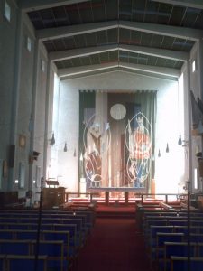
Holtom was a dedicated peacemaker & graduate of the Royal College of Arts. During World War 2 he worked on a farm in England as a conscientious objector. He also was involved with Coventry’s St. Oswald’s Church, Tile Hill between 1954 and 1957. St Oswald’s along with St. John the Divine in Willenhall and St. Chad’s in Wood End were all built at the same time designed by Sir Basil Spence while he was working on the Coventry Cathedral (1951-62).
They were the first parish churches which Spence built in England and were completed in 1957, five years before Coventry was consecrated. Gerald Holtom did the wall hanging behind the alter depicting St. Oswald and St. Aidan (see photograph on left).
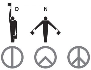
It’s interesting that Gerald Holtom produced one of the most recognisable logos in the world but the story behind how he made it is a strange one. He wrote to Hugh Brock, editor of Peace News, explaining the genesis of his idea: “I was in despair. Deep despair. I drew myself: the representative of an individual in despair, with hands palm outstretched outwards and downwards in the manner of Goya’s peasant before the firing squad. I formalised the drawing into a line and put a circle round it.” (See my interpretation below.) This explanation is a little strange because Goya’s picture actually shows the main person being shot with his arms up.
 Other sources say its design incorporates a circle with the lines within it representing the simplified positions of two semaphore letters (the system of using flags to send information great distances, such as from ship to ship). The letters “N” and “D” were used to represent “nuclear disarmament.” The image of the right shows the “N” is formed by a person holding a flag in each hand and then pointing them toward the ground at a 45 degree angle. The “D” is formed by holding one flag straight down and one straight up. But Holtom was never in any armed forces so how would he know this flag code? And we’re is the “C”?
I think he was a designer who thought like a designer and could see letter forms that could be made into shapes or images in a simplified way. Nothing about men with flags: more an image of a person open armed with hands stretched out showing no arms, guns or bombs! (see my image of the design process below).
There is no copyright on this symbol. Gerald Holtom and the CND movement wanted everyone to spread the message of peace and the thought behind it.


